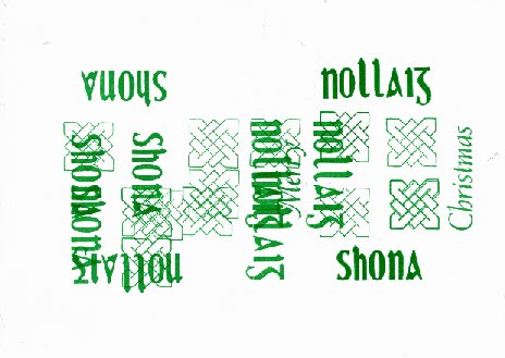
Inasmuch as I’m still catching up with blog posts that I would have written, here’s last year’s Christmas card from the Christmas Card workshop at the National Print Museum. ‘Nollaig Shona (D[h]uit)’ means ‘Happy Christmas (to you)’ in Irish. I’d used ‘Nollaig Shona’ and ‘Merry Christmas’ on the same card before, but this time I thought to put each in a different orientation so that only one is easily readable at any one time and the other, if you don’t pay too much attention to it, can look like decoration.


Happily, Mary Plunkett, who ably ran the workshop, was again willing to print with two colours despite the limited time. The trick is that everybody uses the same second colour (green usually wins that vote), everybody prints their ‘second colour’ parts first, and then the black ink is put on the press without cleaning off the other colour. Black, being black, obliterates the other colour, so the black doesn’t come out as greenish-black. Since I was using the same geometric blocks with both colours, I was the last to print with green, the text was changed without moving the blocks, black ink was put on the press, and then the cards were printed again with the paper oriented the other way.

I was lucky to find two identical blocks with a geometric shape that looks the same in both orientations. I had thought that I would have to use graphic blocks showing winter scenes, and they would have been confusing when viewed the ‘wrong’ way.
The Irish is in an Irish font (sorry, that’s all the information that I have), and the English is 30pt Weiss Italic. I used the Weiss partly because I wanted to use it again, but mostly in the expectation that it wouldn’t jump out at you as being English text when you are looking at the card in the portrait, Irish orientation. I think that it works, but I’m not the best judge since I was training myself on how to read the card even before it was printed.
And from the department of paddling furiously:
