Inasmuch as I’d missed too many sessions to complete what I’d set out to do in the Introductory Letterpress Course at NCAD with Mary Plunkett, I instead made this concoction:

Life’s but a walking shadow
Inasmuch as I’d missed too many sessions to complete what I’d set out to do in the Introductory Letterpress Course at NCAD with Mary Plunkett, I instead made this concoction:

Inasmuch as I tweeted that I have been involved in 21 sessions at XML Prague between 2009 and 2019:
I should provide some details… Continue reading “XML Prague and me”
Inasmuch as this site has been hacked then consequently disabled multiple times over the last two years, I’ve finally done something about it so that, hopefully, the site can now stay up.
I have managed to lose the graphics, the encoding of some of the old posts is messed up, and the default theme is downright ugly, but each of those is fixable. So join me as I strut and fret for another hour upon the stage.
Inasmuch as the Antenna House meetup is back this year at the XML Prague 2017 ‘Unconference Day‘ with twice as much time as last year plus I’m teaming up with Andrew Sales for a Schematron Users Meetup, that makes two sessions at the Unconference Day with which I’m involved. Continue reading “Two for XML Prague 2017”
Inasmuch as I have no affinity for it, I took until this year’s Christmas Card Workshop at the National Print Museum to first use big wooden type. Maybe I was over-compensating for previously ignoring the big type, but since the type was going to be big, I wanted it to be BIG:

The wooden type itself looks more interesting than its result:

 Inasmuch as “Optical letter spacing for new printing systems” by David Kindersley (London: The Wynkyn de Worde Society, 1976, 2nd revised edition) was described as a significant book by the website from where I bought it, I was disappointed that, for all its significance, it reports only inconclusive, intermediate results of experiments on determining optical letter spacing. I was surprised, therefore, to see “but a method of proportionate letter-spacing by computer has been explained by David Kindersley” in “Methods of Book Design” (3rd Edition, Yale University Press, 1983) by Hugh Williamson. Maybe there’s something in it that others can see but I can’t.
Towards the end, it says “I would like to say that there has never been a moment like today where perfect spacing was more possible.” That statement from the second edition has probably been true for every year since the first, 1966 edition. However, we have computing power today that was undreamed of in either 1966 or 1976, so you’d think that by now we would have moved from optical letter spacing being ‘more possible’ to it being practical everywhere.
Inasmuch as the “Type” in the opening sentence of The Relationship between Type and Illustration by A. P. Tedesco illustrates what the text is saying, I was quite taken by it:

It also illustrates a use of initial capitals (to use the term very loosely, since it’s an initial word) that you can’t achieve with either XSL-FO or CSS. You could do it manually with XSL-FO by using side floats to push text out of the way of the initial “Type”, and even creating that would need a few iterations if you’re going to correctly optically align the stem of the “T” with the left edge of the text block.
You could, of course, argue that the aesthetics would have been better if the “Type” was slightly smaller so that the bottom of the descenders on “yp” aligns with the baseline of the third text line. However, we’ll never know whether the “Type” is the size it is because that was the best size available or if, for the sake of aesthetics, they pushed the size of the “Type” to the maximum to minimize the white-space between “Type” and the “alone” on the first line.
Inasmuch as AH Formatter supports MathML 3.0 but on Linux ships with a minimal font-config.xml file, if you are formatting non-trivial MathML on Linux, then you’ll probably need to add some mathematical fonts to your font-config.xml.
 If
If ![]() counts as trivial because you could do it with “ordinary” fonts, then non-trivial would include anything requiring “stretchy” characters, such as the identity matrix example from the MathML 3.0 spec that is shown on the right rendered without and with mathematical fonts. AH Formatter on Linux uses the STIX fonts by default, so the simplest way to get your MathML rendering correctly is to make sure that the STIX fonts are installed and that AH Formatter will use them. Continue reading “AH Formatter MathML fonts on Linux”
counts as trivial because you could do it with “ordinary” fonts, then non-trivial would include anything requiring “stretchy” characters, such as the identity matrix example from the MathML 3.0 spec that is shown on the right rendered without and with mathematical fonts. AH Formatter on Linux uses the STIX fonts by default, so the simplest way to get your MathML rendering correctly is to make sure that the STIX fonts are installed and that AH Formatter will use them. Continue reading “AH Formatter MathML fonts on Linux”
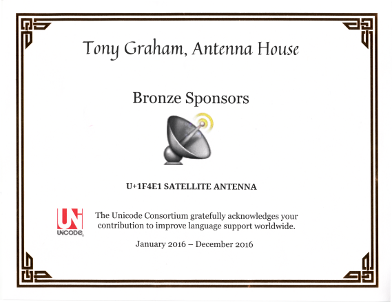
Inasmuch as the Antenna House logo is a satellite dish, when the Unicode Consortium announced their Adopt a Character Campaign, the obvious choice was to adopt U+1F4E1 SATELLITE ANTENNA.

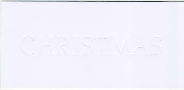
Inasmuch as I wanted to feature the letterpress aspect of the card from this year’s Letterpress Christmas Cards Workshop at the National Print Museum, I dreamt of this:
